2022

i

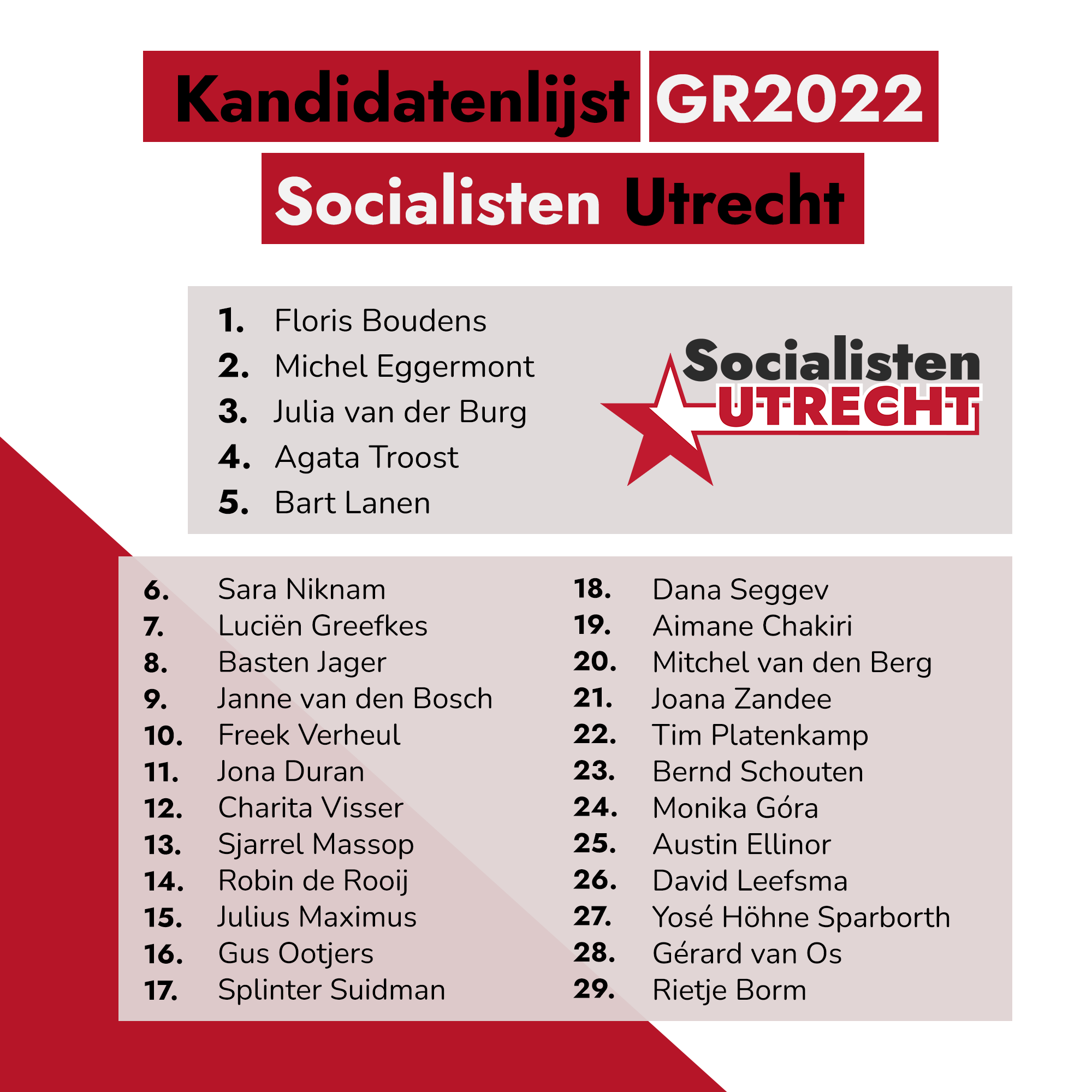
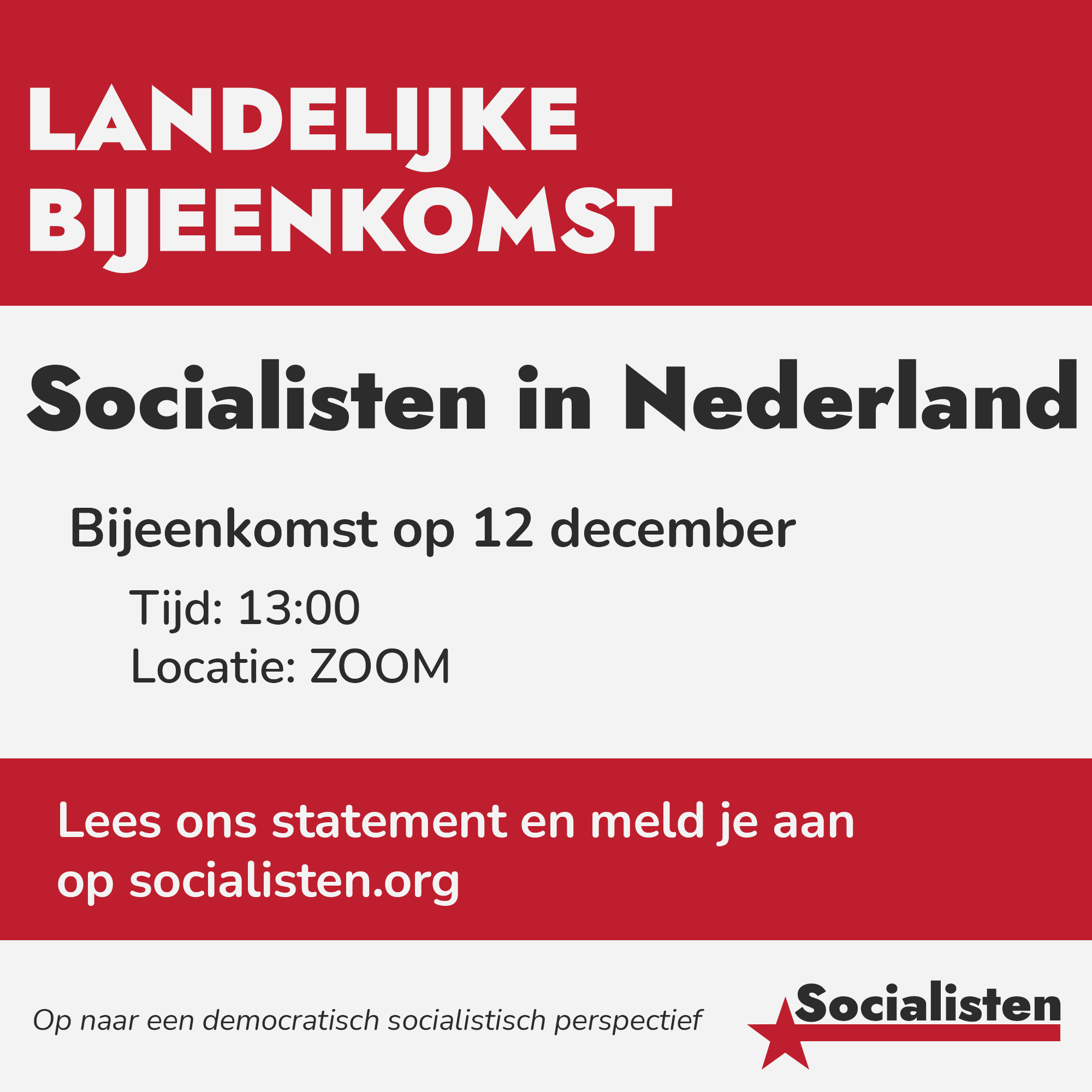
In 2022 I was a part of founding the local political association, Socialisten Utrecht. We took part in the city council elections of 2022, for which I was in charge of designing all of the campaign materials. This included the logo, website, campaign posters, leaflets and stickers.

1 / 6
2 / 6
3 / 6
4 / 6
5 / 6
6 / 6

2021

i

In 2021 a significant group of members got expelled from the SP (Socialistische Partij). This lead to a unity project consisting of SP members and former SP members. In order to get attention for the project, we needed a logo which I designed. I also designed a house style to be used with local initiatives on social media.

1 / 2
2 / 2

2021

i

This project was a part of a social media campaign of ROOD where we wanted to highlight the struggle for LGBTQIA+ equality on our social media. With a small group of people we decided on a couple of topics we wanted to write about, which we divided up and spread out across the month. I was responsible for making the images in photoshop in compliance with the branding of ROOD and maintaining the posting schedule. This included making sure everyone delivered their content on time and posting on time.

1 / 7
2 / 7
3 / 7
4 / 7
5 / 7
6 / 7
7 / 7

2020

i

This project was a part of a campaign with ROOD (at the time the youth organisation of the Socialistische Partij) for organising tenants of housing organisation Camelot (now known as mosaic). We made a small flyer to hand out to the tenants so we could gather their contact information. After a meeting with the tenants we wrote a letter to Camelot with our demands.

1 / 3
2 / 3
3 / 3

2018

i

This project was part of an assignment of my university course. In this project the final deliverable was a magazine. I was responsible for the cover design among with the design of the other pages shown (not the illustrations). For the cover I ended up making every single element, aside from actually taking the photographs.

1 / 7
pressplay
2 / 7
3 / 7
4 / 7
5 / 7
6 / 7
7 / 7

2017

i

#benniebeige was a campaign launched by "Yo Mo!", an online platform, of KRO-NCRV. The campaign was targeting lingeriebrands to be more diverse with their products and to stop using the word "nude" when describing the colour beige. At the end of the campaign Yo Mo! was going to hand in their manifesto, with support of many notable Dutch people, to specific lingerie brands. I was responsible for this and I had to implement their style and image.

2017

i

"Wist je..." was part of a series we did for the instagram of de Keuringsdienst van Waarde. The intention was to promote a game/quiz that had just launched on their facebook page, we took questions from the game and posted them on instagram to generate more traffic to the game.

wistjebanaan
1 / 3
2 / 3
wistjeplastic
3 / 3
wistjepeking

2017

i

Gespot was already a "series" on the Keuringsdienst van Waarde's facebook page, it used photos and comments submitted by users and did very well, however the design of the post left something to be desired. I was in charge of redesigning the format

1 / 3
mexicaansthais
2 / 3
kalfslever
3 / 3
groentensoep

2018

i

De Keuringsdienst van waarde would post two articles after every episode to elaborate on the episode. With the article there needed to be a thumbnail, this would show up on the social media channels and the website, it was a very important part of generating clicks. The images needed to allude to the conent of the article, suit the brand of the show and also be a little funny.

2017

i

The website of Keuringsdienst van Waarde needed links to other pages on the site that had extra content or background information. Some already existed but needed a redesign and others needed to be designed from scratch. It was important for them to stand out.

1 / 4
KVWquiz
2 / 4
kvwvraag
3 / 4
over
4 / 4
tndb

2016

i

At the University of Hertforshire for the course "advertising" I needed to design a poster for a campaign of Amnesty International.

shapeourfuture

2015/6

i

In Study Association Escape, we had events, these could be parties or guest lectures and in order to advertise them. And it was my job to design them.

1 / 3
arboesc
2 / 3
tastesow
3 / 3
paulb

2015

i

During my second year at Escape we needed to redesign the logo. We did this in a team where we had weekly brainstorming sessions to come up with ideas, however I ended up being responsible for the final product

esc

2015

i

In 2015 me and some friends were throwing a small "music festival" for some friends, and we decided that we needed a logo, I took full responsibility for that and made something that fit the title.

bnb